Bold Type Project


The Brief:
Create a display font and consider some of the following points:
How far can you push readability without affecting legibility?
Considering the 1000s of typefaces in existence, how can you differentiate yourself?
What systems and rules can you use to create a face?
Design group 8vo*, once said:
‘We believed that typography, the key building block of printed communication, could be the core ingredient of a graphic solution (unsupported by illustration or photography...)’
Inspired by the promise of communication through the (digital) craft of type design and in the visible resurgence of bespoke typography, we’d like you to explore the emotive power of type when used on its own. From the early Dadaist experiments, via the Bauhaus, to today’s radical trends, type has never been so readily available - digitally made and shared instantly on the web. Unlike the era of machine set type, where technicians toiled for hours, today’s designers can bypass convention and produce type that flows with the zeitgeist. Once there were rules, now everything goes and nothing is off-limits.
11/1/19
Today we were briefed for the Bold Type Project with Bhav Mistry, alumni of Chelsea College of Arts & designer at SEA London. He showcased a lot of his work which is really good, making me a little nervous for this project as I've never delved into the world of type before & creating a font sounds like a really technical & fiddly project. I know what kind of typefaces I like & dislike, but I don't really know what I want to create yet (or what I can create). We also learnt a lot about existing font foundries & studios such as Monotype, Lineto, Fontsmith and Dalton Maag who designed the existing "Lush" handwritten lettering, "Airbnb" typeface, "BBC" typeface, Rio 2016 typeface and many more. It's so interesting to learn about the minds behind these typefaces that we see everywhere, every day. Bhav mentioned that a few of his typefaces have been used in publications & exhibitions unbeknownst to him which I found quite amusing. We were then split into groups and asked to present the independent Swiss type foundry Grilli Type to the class. My favourite typeface of theirs is GT Haptik.
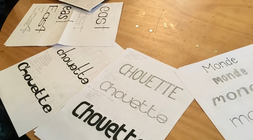
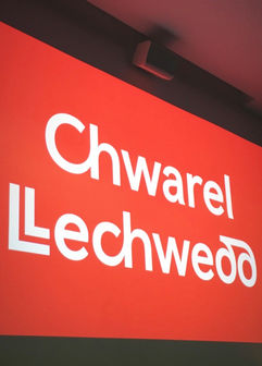
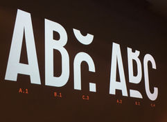
Here are some pictures from Bhav's presentation.
14/1/19
Jake Hopwood from Work-Form came in today (originally to help us get started with our Editorial brief) but I've found the session to be valuable in helping me gain a better understanding of hand lettering & designing fonts. Although we had to follow specific type-based "rules" I created different typefaces of diverse styles. I could end up creating my own typeface for my magazine.
18/1/19
Today I presented to Bhav my research from the week. I've scoured through many library books such as "Creative Characters" by Jan Middendorp, "ABZ" by Julian Rothenstein & Mel Gooding & "Editorial Design" by Yolanda Zappaterra, to gain inspiration & ideas for my future typeface. The amazing TypeTester on the F37 Foundry website is a brilliant tool in gaining inspiration for modern typefaces, & I included my favourites in the presentation below. I find that I'm drawn towards sophisticated typefaces with a vintage feel, but a typeface that would look well on a "Vogue" Magazine. I will start experimenting with Illustrator next week to create a first draft typeface.
22/1/19
COLOPHON - Tuesday Talk
I loved this talk. Colophon is an international, award-winning type foundry based in London & LA. It was a pleasant surprise to discover that they've been working alongside Smörgåsbord Studio (a Welsh design studio based in Cardiff & Amsterdam) on the rebranding of Wales with the Welsh Government. I love the work of Smörgåsbord Studio & have been following their work & rebranding for a while (since I am Welsh). It is owned by Dylan Griffith, a Welsh designer of whom I admire. Therefore, listening to Colophon explain their intentions with the new "Cymru/Wales Sans" typeface was brilliant & it was lovely seeing a little bit of home being represented in the lecture theatre. I really admire what they're doing because of this & they have kept the essence of the Welsh language well within the typeface which is really important to our heritage. It is also worth noting that they've created a typeface for the fashion brand "Nasty Gal" and many more. They're clearly extremely talented in what they do.
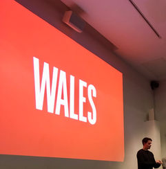
25/1/19
Last weekend I went to Canary Wharf to visit the Winter Lights Festival. While I was there I passed The Ivy. I've always loved the typeface, therefore I want to create a typeface inspired by the visual identity of "The Ivy" designed by United Creatives, Manchester. I've always been drawn to typefaces with a 1920s essence. I want to create something slick & classy that would be attributed to an extravagant lifestyle or a high-end editorial.

However, I've struggled this week. It's my first attempt at creating a typeface & I've ended up with this, which looks a little more Dadaist than slick & classy. After talking with Bhav I realised that I had made the rookie error of not using grids in Illustrator while creating this typeface. There are aspects of this typeface that I like (letters DEFG), but it definitely needs refining & I'm not proud of it. Bhav thinks I should go down the Dadaist route & create letters of different sizes, but I want to give my vision one last attempt.

1/2/19
This week I've worked really hard watching what feels like 100s of "how-to" Youtube vids to create this typeface. Juggling it with the editorial brief has been a challenge because I am passionate about both, but I don't feel that what I presented last week was up to par.
My new typeface has definitely had a glow-up.

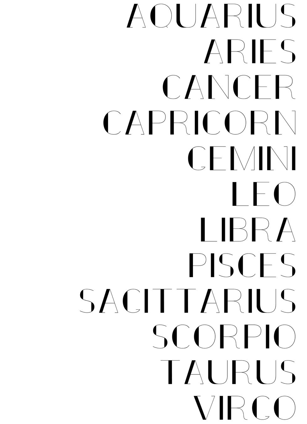
Bhav is happy with the outcome. I've decided to call my typeface "Anna" since I'm proud of the "A" & I wanted to showcase it in its name. Also, obviously I'm Anna, but the name itself is symmetric & looks nice in the use of this typeface. I wanted to create a display font only & feel that I've achieved my goal of creating something classy & chic, but with a twist. I couldn't decide if I wanted to create a serif or sans serif font, so I opted for a mixture of both. It's not perfect but for my first ever typeface I'm really proud of the work that I've put in. I can see myself using this for my own branding in the future.
3/2/19
Here are some poster designs using my typeface. I think I'm going to opt for the "Stay Classy" one.


