Rebranding Digbeth Project
The Brief:
(Set by brand and design consultancy dn&co.)
Create an identity for Digbeth, Birmingham, that resonates with big & small business as well as engaging the local community. Your identity proposal should encompass the area and not one specific business or business type. Make Digbeth a world-renowned creative business district.
What are the challenges?
-Reflecting & preserving the area’s unique character without resorting to pastiche.
-Remember the diversity and heritage of the places & people.
-Securing stakeholder buy-in (think about championing local voices).
Things to consider:
Your identity could be a flexible approach (something that can adapt and change depending on use).
Consider how the brand could work in the physical environment (supergraphics on Digbeth’s streets for example) as well as in more traditional touch points (websites / posters).
A bit of history:
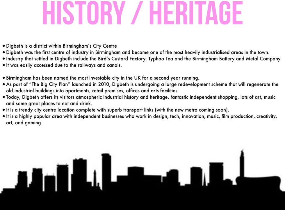
After London, Birmingham is the second-most populated city in the UK. The industrial revolution brought unprecedented industriousness and invention to Birmingham. Digbeth on its outskirts, a place for manufacturing since the middle ages, was its engine. Today, a concentration of young creative businesses pioneered this neighbourhood and flourished (a bit like Shoreditch 15 years ago…). A once overlooked part of Birmingham is rising to its potential. This historic site of Birmingham’s industrial revolution is now going through a revolution of another kind: in design, tech, innovation, music, film production, creativity, art, gaming. This is a place for industrious folk. Digbeth is a diverse community of driven businesses doing their own thing, mostly independently owned and free of outside control, who aren’t afraid to help each another out. A neighbourhood of free spirits, creators and thinkers, who fall squarely outside the mainstream. Individuality is celebrated here. Digbeth is a constantly evolving neighbourhood and the spirit of that evolution can be distilled into three attributes:
— Industrious
— Individual
— Independent
These three attributes represent the spirit of what makes Digbeth’s character different.
6/10/18
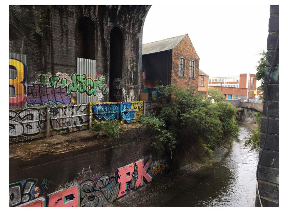
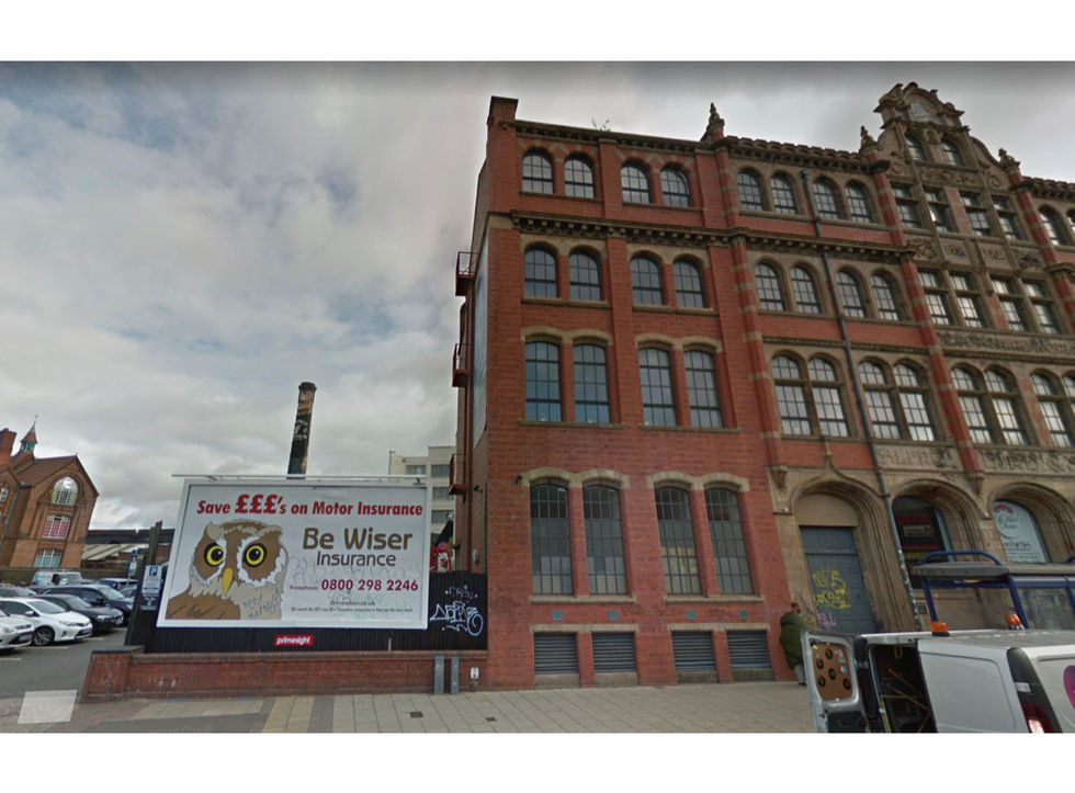
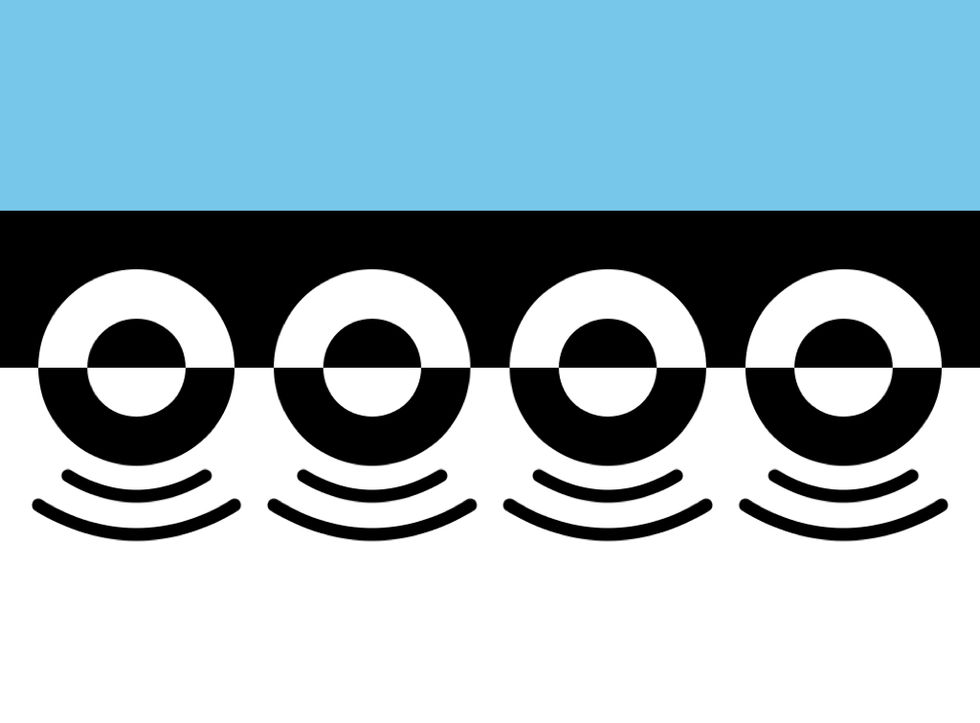
Dn&co visited at the beginning of the week to brief us on our first project of the term. The concept is really interesting as I've never heard of Digbeth until now but it sounds like an intriguing place. I have never embarked on a branding project before & I'm not that experienced with illustrator & have never tried simple things like logo design so I'm a little wary. Dn&co have worked on countless massive rebranding projects & they specialise in rebranding large areas & giving a place a "name". This week I've researched into Digbeth and what the place has to offer. I also messaged a friend who's an art student studying at Birmingham & he said the place is really "up & coming" with lots of good club nights, cafes & LOTS of graffiti. I definitely think the rebranding of Digbeth should be colourful & fun in order to portray the area, because too many business-centric brands are bland & "corporative" looking. That shouldn't be Digbeth. Digbeth is full of interesting architecture & quirky buildings such as the "Custard Factory". I've also found the official Digbeth flag to be a good catalyst to my ideas as it is unusual. Maybe I could remake the flag of Digbeth. I've sourced a few images for my mood-boarding & would definitely like to explore the concept of supergraphics for this project.

8/10/18
Presenting our ideas & research.
Today I presented my research & pitches my first initial ideas for Digbeth's rebrand. I couldn't decide on a logo but Peter suggested I explore more into the idea of a new flag for Digbeth.
15/10/18
Presentation of further developments.
I superimposed my Digbeth flag onto pictures taken at Digbeth to produce a realistic outcome. Peter likes my idea of using the flag as supergraphics for the area as I'd hope that the people of Digbeth & the creative industry would attribute this flag with Digbeth therefore seeing it in abstract ways forms the DNA of the place. Regarding the other logos I've created, my personal favourite is the blue & pink striped banner therefore I'll further explore my concept using this visual identity.
16/10/18
KOTO Tuesday Talk.
"Proudly independent, we work at the intersection of brand and digital from our studios in Berlin, London and Los Angeles. Helping the world’s best brands become even better."
It was fascinating seeing the massive projects that Koto studio had worked behind. They created the logo for Airbnb, rebranded Fanta, Sonos speakers & FatLlama.

18/10/18
Updated presentations. I've created t-shirts, a tote bag & stickers displaying my rebrand of Digbeth. Peter has asked me to shorten the sleeves of the t-shirts, but otherwise I feel positive about my work. The hand-in is tomorrow so I better get working. I left uni at 8:30pm tonight.


19/10/18
I've handed in my presentation along with the updated t-shirts today, ready for our official presentation at dn&co studios on Monday. I'm proud of the outcome & feel that I've personally done well regarding that this is my first attempt at a rebranding project. Obviously it's not perfect but I feel that I have followed through with my concept, creating a banner that morphs into the DNA of Digbeth.
22/10/18
Today we visited dn&co studios in the most beautiful location of London for our presentation. Their studios is just off Bermondsey Street & the surrounding area is absolutely beautiful with a gorgeous french patisserie & cute cafes. Anyway that's besides the point. It was a successful day. Everyone's work was great but comparing my work to theirs made me realise that my approach to this project was different & not so clinical, probably because I've not embarked on such a project. I've enjoyed this branding project more than I expected, and it has definitely pushed me to use software, making me a little more confident about my work. It was interesting to see dn&co's interpretation of the brief, since this live brief was a genuine job of theirs.


