Editorial Project
The Brief:
Produce an editorial magazine. Think of a theme for your own magazine and produce it, taking responsibility for design and content, and to share this with your audience by whatever means necessary. The success of your outcome will be judged not only against a Graphic Design criteria but also by how well you communicate and connect with your audience.
The following criteria should be considered:
Research
Concept
Design
Communication
Audience / Marketplace
This brief is designed to give you a chance to explore editorial design and art direction through the production of your own magazine. A magazine is a periodical publication that contains articles, photographs and illustrations, often based on a particular subject or aimed at a particular readership. Magazines are generally a commercial enterprise with a specific target audience in mind. Circulation of magazines can vary from a small local market in a specific city or to a much wider global audience. Over recent decades, the gradual shift from print to digital content has created difficult circumstances for traditional print industries. The Internet has changed the landscape irreversibly... however the magazine lives on both in the form of a handful of big name publications and also the glut of bespoke titles that are launched each year.
7/1/19
Briefing.
Today we were briefed for the new editorial project. I can't wait. I've always loved magazines, ever since I was a child reading "Sugar" & a lot of my art work during school & Art Foundation was based around fashion magazines. I also have a massive collection of Vogue/Elle back home.
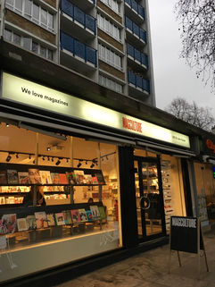
I spent the majority of my day at the uni library & at MagCulture to gain inspiration (now my new favourite place to be). I literally spent 4 hours there & was the last one out of the shop, but I ended up buying Wonderland & Primary. I wanted to buy Nicotine & Chaos Magazine but I don't have £100 spare. I don't know where the time went. I already have an idea of what I would like to produce. From the brief this morning I know that I'd like to create a heavily art directed fashion/lifestyle magazine, with a lot of colour. Maybe a different colour assigned to each spread or colours to signify a specific theme? It would be fun to do my own photoshoot with real people but the subject has to be interesting.
8/1/19
Today we had a proper all-day presentation for the brief. It was interesting to see inspiration from the likes of "Twen" magazine & how that magazine has seemed to withstand the test of time.

One thing that sticks out like a sore thumb thus far is that printing is a massive part of this brief & I haven't got a clue about the technicalities. I'm also kinda inexperienced with Indesign but at least this project will push me. Type terminology such as "baseline" "meanline" "ascender/descender" & "slug" are new to me. Also grids. Remember to use grids.
"The grid is like the lines on a football field. You can play a great game in the grid or a lousy game. But the goal is to play a really fine game" — Wim Crouwel.
In the afternoon we were introduced to hundreds of different types of paper along with new terminology such as "gsm" (who knew). We're encouraged to be experimental with the paper size, weight & design of the magazine but I've always wanted to create a traditional looking magazine. I don't want any fancy bits & bobs to distract the audience away from the content. It would be amazing to create an eye-catching title though, maybe with the use of silver foil or holographic printing. I'm not sure if it's expensive to do so.
10/1/19
Indesign Basics Workshop
Today's workshop was an intro to Indesign. I'm definitely going to use "perfect binding" for my magazine & Gen was explaining how we need to set up a certain layout with specific bleeds (3mm) & margins before taking the work into print.
I've had more thought & I'm really leaning towards the idea of creating a magazine based on Star Signs. I'm going to start creating moodboards to understand what my mind is trying to put together, & then I'll take it from there. I want to create something for me, something that I'd be interested in reading.
14/1/19
Jake Hopwood from Work-Form came in to give a session on typography, again teaching us about the terminology of the subject & how to organise type. The rest of the day was based around a challenge, where we would follow certain rules to "guess" what the typeface described looks like. I've decided on the title "Twelve" for my magazine, as there are 12 signs of the Zodiac.

15/1/19
Today was our first project session with Peter. I've been working on two separate ideas for a magazine by using Pinterest. My first idea, and probably favourite, is to create a magazine based on Astrology, where I photoshoot 12 different people with different star signs, and assign a specific colour to their sign. I would need to scout for people with an interesting story but if I'm able to do this I know it would be amazing. Astrology - but with a twist, because I'm bored of the whole wishy-washy "magical" aspect to Astrology. It's just a bit of fun really. I've always read the Astrological part at the back of a magazine though so it's a chance to bring more light to the concept. My other idea was to create a magazine filled with satisfying visuals (like ink in water, slime, that kinda thing) and write articles on self help, meditation, well-being etc.
Here's my presentation from today, filled with my moodboards & a short intro. Peter says I should go with Astrology as I clearly have an interest in it & the title "Twelve" is perfect. However, realistically I won't be able to arrange a photoshoot with 12 people by the next 2 weeks, so I must resort to only focusing on 3 people/signs for this issue. I could hypothetically make it a publication every 4 months to cover all the zodiac signs.
17/1/19
Gen's Indesign workshop was really helpful today. I'm a newbie with indesign, so discovering about "Pantone swatches", "paragraph styles"and what layout to use for perfect binding was really useful. Here are my notes (mainly for me to refer back to).
Indesign
Don’t use too many pdfs (more jpg)
Facing pages
A4
Full bleed
Standard 3mm
Coverpage
What’s the content of the magazine?
Layout - create guides
Master page - page numbers
Remember to apply master pages to page if u want content on it to be printed
Workspace - typography
Text box - change style - character styles
Good for headings sub headings bodies of text
Can change font in one click
Click text box - big A click - character style - name character styles
Or click character styles - body text & change typeface
Check spelling
Error messages - preflight panel
Click+Alt
Place images- cmd + D
Cmd + Z - move image
Click & drag to fit
Frame (has X through it)
Fitting - fill frame proportionally - pic fits frame
Insert - special character - markers- Page numbers - master page/spread
Draw text box - type - markers - current page number
Turn off hyphenation - new style - hyphenation - uncheck all words that have been hyphenated
Type insert hyphenation - en dash - end dash (longer dashes)
Paragraph styles - used to style paragraphs
File setup - organisation
CMYK is for print
Image - mode - CMYK - always put images in photoshop & set to cmyk
Images placed in links panel
Colours! If u want to add diff swatches
Click of swatches - menu option
Insert - new colour swatch & customise
Colour Mode - pantone options - coated (c)& uncoated (u)
If u want to save swatches from photoshop to put in indesign - cmyk - save as .axe
Shift click all colours & save swatches
Save files oragnised
Indesign files
Assets - ai jpg png
If u want to decorate page - add new layer & use that layer to lock the layer
Grids - indesign CC - preferences - grids - show baseline grid - (12.7mm measurement between edge if page & margin) - aligning text - paragraph styles - align to grid - all lines
Binding - Middle of page 2cm gets lost so adjust in indesign
For perfect binding magazine
Change margins
Layout - margins & columns - inside 30 to avoid not seeing whats being printed on the page - getting lost in the spine
Save as -
Package - no links will be broken in transferring indesign doc to somewhere else
File - export - adobe pdf print - export as pages/spread - hide visible guides
17/1/19
Went to the library again for some inspiration & ideas for a magazine cover & the type of paper I'd like to use.

21/1/19
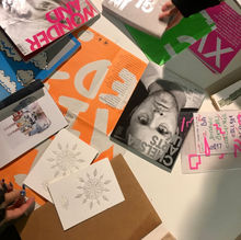
Another session with Jake Hopwood from Work-Form today. After his presentation, we designed invitations for our "magazine launch" by tediously cutting our tiny letters & sticking them onto a postcard.

21/1/19
I've done my first photoshoot today with an "Aquarius". I wanted Megan to look a little eccentric & other worldly - like an alien. Aquarius are known to be a little unpredictable but one of the most creative signs of the zodiac, and they're the humanitarians of the zodiac always speaking up for what they believe in. Aquarius is also an air sign. A "space" theme is prevalent in this shoot & I will probably edit the background in Photoshop to a colourful galaxy.
I created this Pinterest moodboard: https://pin.it/y5cech75tejywr


22/1/19
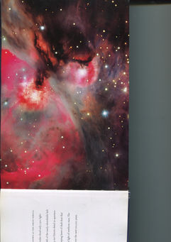
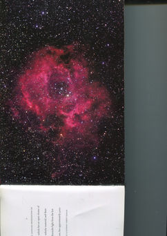
I've picked up a lot of nature & science books about the universe from the Chelsea Library (who would've thought we had these?). I've sourced some beautiful pages with stars & galaxies that I could use in the Aquarius shoot. The only problem is I've scanned 150 pages. Here are a few of my faves.

23/1/19
What a day.
Today I had my first photoshoot with my friend who has 159k followers.
I want this magazine to be about star signs but to also celebrate our diversity and what makes us all individual. She was amazing to work with & I feel really lucky that she was down to work with me on this project. I'd like to insert an interview about her life as an online personality since it's an intriguing topic.
My vision was an all pink theme to go with the idea that Virgo is the Goddess of the signs & I wanted to capture the essence of innocence & purity in the images. Virgo is also known for being hypo-critical therefore having a few images of her looking moody was a must. I'm proud of the outcome as it's the first time I've ever done my own photoshoot. I was in control of the art direction, lighting & everything in-between. Here's the moodboard & a few of my fave pics from the day.

24/1/19
Today I contacted the printers at Service Print near Borough. I've decided on making my magazine A4 size with a matte finish & perfect binding. This may seem "boring" but I don't want to play around with crazy ways of binding the magazine. I want it to look realistic, like a fashion editorial you'd find in the shops. I took these notes while on the phone with the printers.
Outer cover 7ml gutter
10mm away from edge of inside margin
Cmyk
3mm bleed & cropped
1 pdf file
With single page pdf files
£45 for 2
250gsm matte
120gsm matte
Submit pdf on website
25/1/19
More library visits looking for layout inspiration. I find that the best method for designing layouts is to see it away from a screen.

27/1/19
Looking through the magazines I bought from MagCulture - Primary & Wonderland. Primary magazine probably has the most beautiful pages I've ever seen in a magazine, & the art direction for Wonderland is just perfect - quirky & fun.

29/1/19
Editorial session & Photoshoot

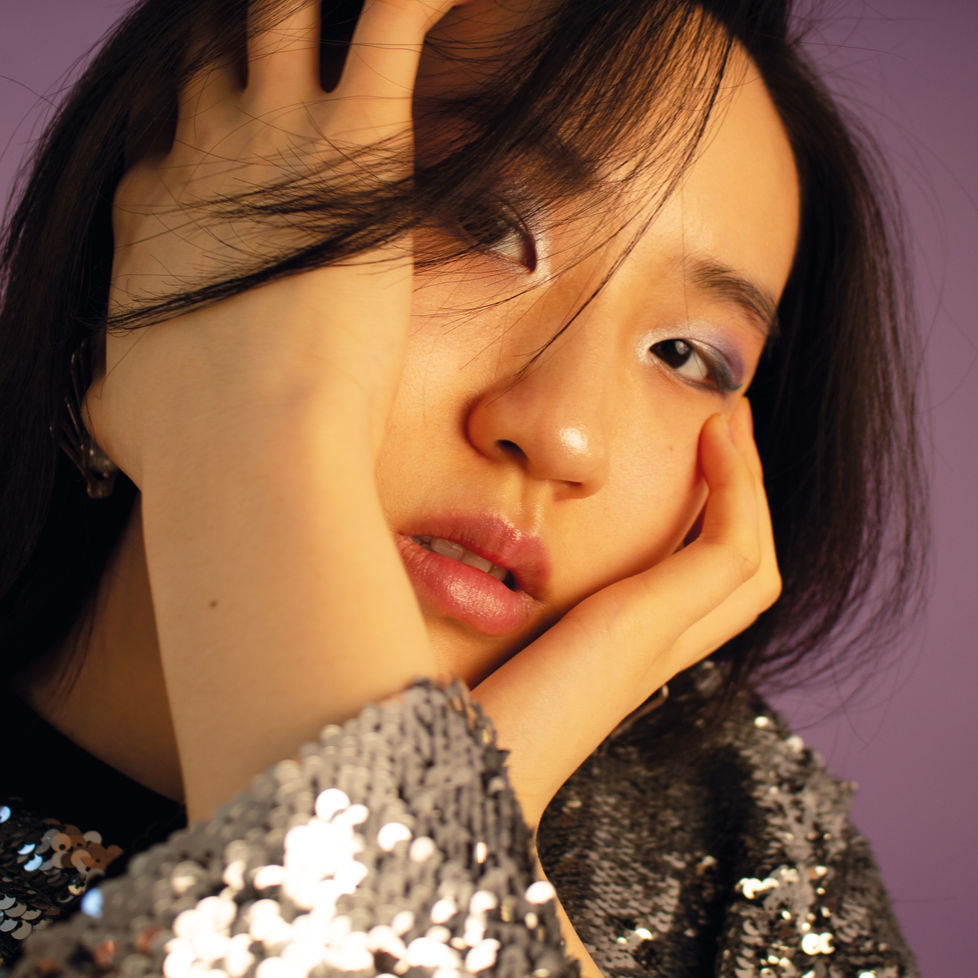
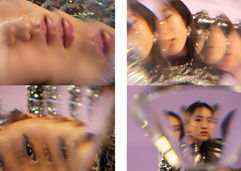
I arranged a photoshoot with Jacqueline at uni today to do a Pisces shoot. I wanted to capture the kindness and gentleness of Pisces in today's shoot, and while Pisces is a water sign symbolising fish I chose to work with purple colorama. The same set-up as the Virgo shoot. Jacqueline was great to work with & I've captured really beautiful shots & used a prismatic effect by placing a glass ornament in front of the lens. I must say I'm really enjoying this self-directed project & feel comfortable doing the art direction and executing the photoshoots myself. Here's the moodboard & a few of my fave pics from the day.


29/1/19
BAM Tuesday Talk
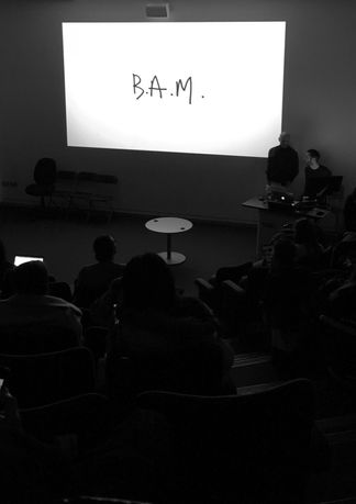
A hilarious talk from the design and art direction studio founded by David McKendrick and Lee Belcher. They've worked on countless magazines such as Luxx Magazine & seeing what they do has really made me consider if I'd like to work for the editorial industry in the future.
1/2/19
I sent the magazine file off yesterday to be printed. I've picked up the magazines today & I'm SOOOOO happy!!! I'm glad my measurements were all correct in the Indesign file. I haven't had any sleep over these last few days, but I've managed to accomplish what I set out to do & I've actually enjoyed the all-nighters(??). I came up with the concept of "Astrology, but with an edge", I wrote the entire content myself, I have an exclusive interview with ***, I did all the art direction & design & I've officially created my first magazine! I wanted to create something that would appeal to me, so that's what I did. A few months ago I wouldn't have had the confidence to push myself & actually pursue this idea. I'm not the most technical, and there have been a lot of firsts for me with this project but I'm feeling really positive about it. Art direction is definitely something I'm likely to pursue in the future. My favourite part was doing the photoshoots & seeing my ideas come to fruition.
Here are my pack shots of some spreads. Click to enlarge.

Some pages from the magazine (Copyright of Anna Jên Huws).


